

Expert
UX UI DESIGN
Role: UX Designer
Tools: pen & paper, Balsamiq, Sketch, Invision, Principle
UX Immersion course project at CareerFoundry
Background
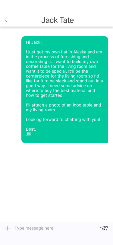
Expert is an app designed to give users a platform to connect with experts at the spur of a moment when they need consultation. Similar platforms like Quora can take days for someone to respond to a query or Google can take users down a rabbit hole in search for a reliable answer.
Whether you need advice on event planning or specialized knowledge on motorcycle maintenance, Expert can keep you informed and confident.
Scoping out the Market
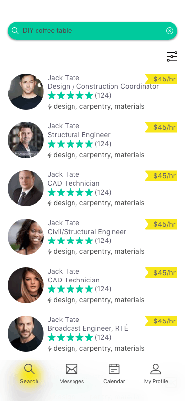
I’ll be using the terms “asker” and “expert”. Askers are those who use the app to connect with experts to receive advice/coaching/answers. This project is focused on designing an app specifically for the askers.
To start wrapping my mind around this brief, I jotted down some potential problems:

PROBLEM STATEMENT
“Askers need a way to easily juggle their questions with the right experts via various mediums (text messages, audio calls, and video calls), because users need quick, reliable answers.”
The Research
With these questions in mind, I conducted a competitive analysis on 2 of the top (ranking on Google Search results) connect-with-an-expert type apps. Here are some interesting findings about this marketplace:
Both apps limit asker-expert communication to just messaging.
There's a large pool of people eager to share their expertise to earn money at their convenience (time and location).
Generally, their websites are underdeveloped.
I aimed to draw a portion of the market share by focusing on seamless interfaces and really hone in on the users’ journey, taking them through quickly scheduling a session with appropriate experts.
High-level product requirements broken down into granular user stories
I chatted with 3 tech-savvy people within the age range of 20 - 30 years. I sought out to find out about their daily routines, what kinds of everyday issues/questions they’ve run into recently, how they troubleshoot, and the pros & cons of the troubleshooting resources (ie: Google Search, Youtube, social network).
High-level takeaways from user interviews
1. All interviewees used more than 1 resource (ie: Google Search, Youtube, Google Maps, Yelp, social network) to find answers to their everyday questions.
How can I eliminate that extra effort and find a road of less resistance?
2. The interviewees very commonly sought out their social network for advice and insight for a problem, because there’s already a level of trust. As with Yelp and Google Maps, one interviewee stressed the importance of the business’s star rating and the number of reviewers: a trust in the collective opinions of the mass.
How can I give the users a sense of trust in the experts and a meaningful experience, so much so that they would return to the app time after time?
3. There are so many possible topics of interest to recruits experts for.
How can I make sure the topics are and stay relevant to the potential users?
Personas
The research helped define the potential users and create 2 customer personas:
The occasional event planner: they will use the app whenever they have one-off questions or need to bounce off ideas with an expert to avoid bothering friends/family
The master of disciplined hobbies: they want a more long-term, wholesome relationship with an expert(s). They’ll be using the app on a regular basis to schedule/reschedule session with the expert.


To lay out the app’s information architecture, I created the initial site map, which will be tested and reorganized.
initial site map
Card Sort
6 of the 8 participants created 1 or more new category on their own for a better fitting category title or for clearer organization. With this, I made changes to the site map.
revised site map after card sorting exercises
Initial Wireframes
The features I focused on were:
search topic/question
choose & message an expert
schedule a session with the expert
view & edit scheduled session
boom!
pow!
version 1 of high fid prototype
Put it to the test
Now that I had a prototype prepared, I conducted the first round of usability tests with 6 participants. I wanted to identify any friction in the mobile app as I asked participants to interact with the app to utilize the core functions.
I chose 5 of the highest priority issues to focus on and jotted down solutions to implement into my next iteration.


issue 1

suggestion

issue 2

suggestion


issue 3
suggestion


Spring Cleaning
Once the top 5 issues were taken care of, there were some elements whose size and spacing were unbalanced. Some screens looked too bare while some were congested. I used Gestalt Principles and Google’s Material Design to do some spring cleaning.
Peer review
After polishing up the designs through spring cleaning, I collaborated with 3 peers to review my prototype and implemented some of their feedback.
How can I make the app more accessible?
1. Quick Sign Up
Remove “Explore as Guest” option since most people will use that option… in other words, no incentive to sign in or create a new account.
Add options to sign up with Google or Facebook. This process is just as fast and simple as the “Explore as Guest” option + no need to memorize another new username / password.
2. Sorting Search Results
The sort by option “Most Relevant” isn’t very intuitive or meaningful to users. What does “relevance” depend on? What algorithms are beings used?
A more understandable sorting option might be “Popularity” or “Price: low to high” or “Price: high to low”.
3. Distinguishable Nav Bar
The bottom white nav bar is the same color as the white background of the main content area with no distinguisher.
Elevating (z-axis) the nav bar sets itself apart from the main content area while keeping consistent with the rest of the UI.
4. Consistent Search Bar
The search bars on different screens look different and search for different things. However, the look of the search bar should stay consistent.
5. Larger Clickable Areas
The interfaces for scheduling date, time, and call method use radio button. According to Fitts’ law, these tiny radio buttons can be hard to click or tap.
Create larger target area by letting users tap not only on the small radio button but also the label or associated words.
Adding animation as user selects an option will add more reinforcing cues.
6. Customized Action Button
Text fields have various functions (ie: email address, zip code, search, send).
The default keyboard has a return button on the button right corner, but it would be more practical to replace it with an action button (ie: next, search, send, go). This lets users to complete their text input process solely through the keyboard space.

Retrospective
I’ve realized how important it is to frequently zoom my perspective in and back out of my project to not lose focus of the larger picture and overall goals. For a good chunk of this project, I was zoomed way in, focusing on the pixels, layout, and making the app feel professional and trustworthy. For example, one of my initial intents (also written explicitly into my user stories) was “to be able to register using a social media account so users don’t need to think of / memorize yet another set of username and password”. However, I lost sight of that in the midst of moving pixels that I excluded that feature till coming around to it in my last iteration.
User testing, and even casual peer reviews, were so helpful in smoothening out small hiccups in my designs. The earlier and more frequent, the better. 👍