

gathr
UX DESIGN
Role: UX Designer
Tools: pen & paper, Adobe XD, Principle, Google forms
a personal quarantine project
Background
Once COVID-19 spread itself into a pandemic, I stopped my eating-out routine and decided to cook more. Although I was excited to learn new recipes, I soon felt the stress that comes with deciding what to eat twice a day. Having only occasionally cooked simple omelettes and pasta dishes, I dreadfully planned for each consecutive meal for embarrassing amounts of time.
I’ve Googled things like “what to make for lunch” or “healthy dinner dishes” many times to realize I’m missing a couple ingredients. I’ve tried recipe websites and apps to find either too many ads, confusing user flows, user-unfriendly features, confusing recipe pages, inconsistent / unappetizing / missing photos, absence of serving size adjuster, etc…
PROBLEM STATEMENT
“How might we create a stress-free experience for people cooking at home to quickly decide what to cook and know how to make it?”
Competitive research
People are cooking or learning to cook at home more than ever. However, this market hardly has any PWA (progressive web app), which allows for offline usage and usage on multiple devices without having to download a native app. I conducted a competitive analysis on 3 of the top search results (based on Google Search ranking + third party blog marketing). Here are some findings that I took into account for the early wireframing and brainstorming.
Things I liked
Takes all the ingredients in pantry list and suggests recipes using a few of those ingredients, if not all
Fetches recipes and parses them into categories
Categorizes ingredients as buttons that can be tapped on to add or tapped on again to remove
Shopping List feature is easy to use, similar to how I make grocery checklists on my iOS Notes app
Good SEO
Things I didn’t like
Too many ads that interfere with usability
Chunky text blob before reaching the recipe (confusing content, especially when the text blob goes into details of the recipe and people mistake that as the actual recipe)
Mobile website looks like a native app but is not a PWA
Too many recipe choices (in the hundred or thousands)
Recipes take users to a different site, the original blog page
Grungy, unappetizing, inconsistent, user-provided or missing thumbnail photos
Unclear how to delete an ingredient after inputting it
User research
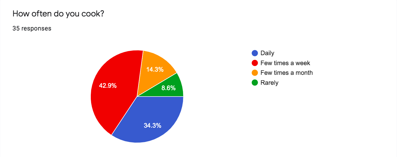
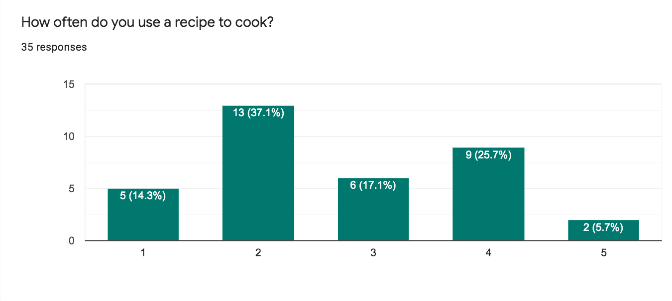
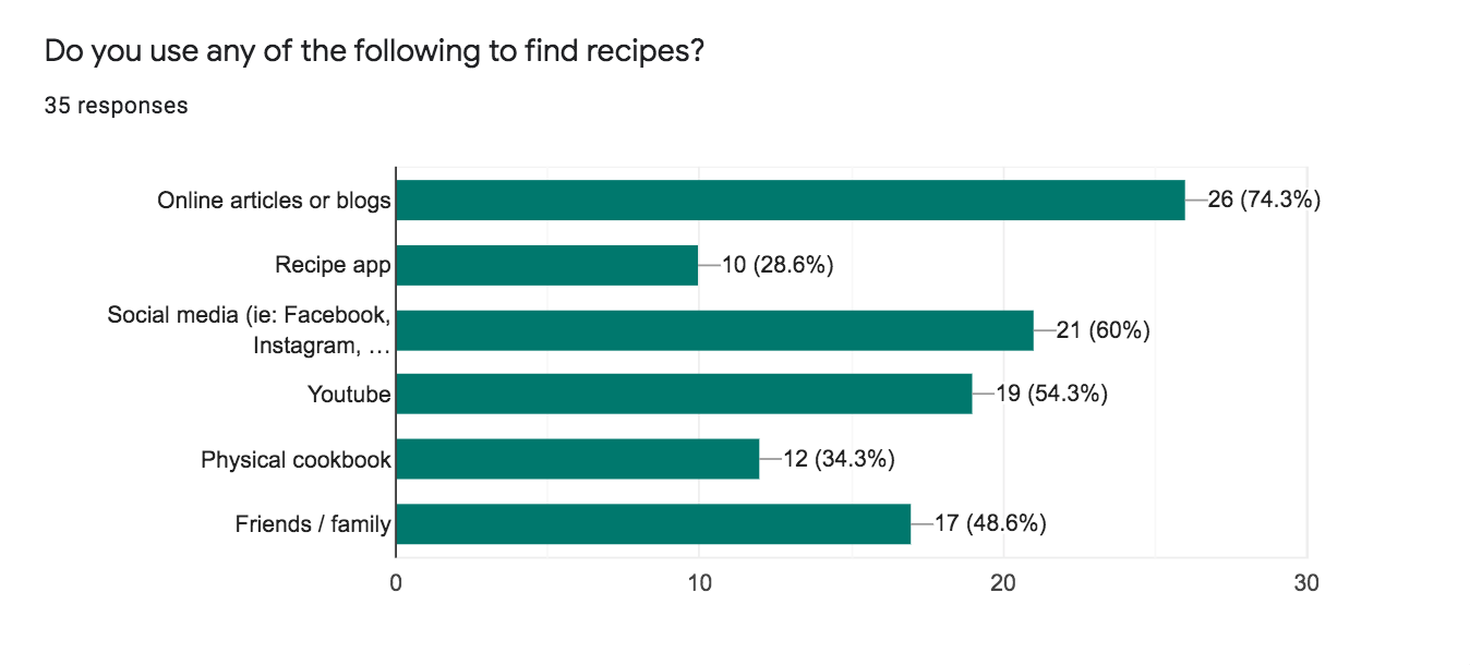
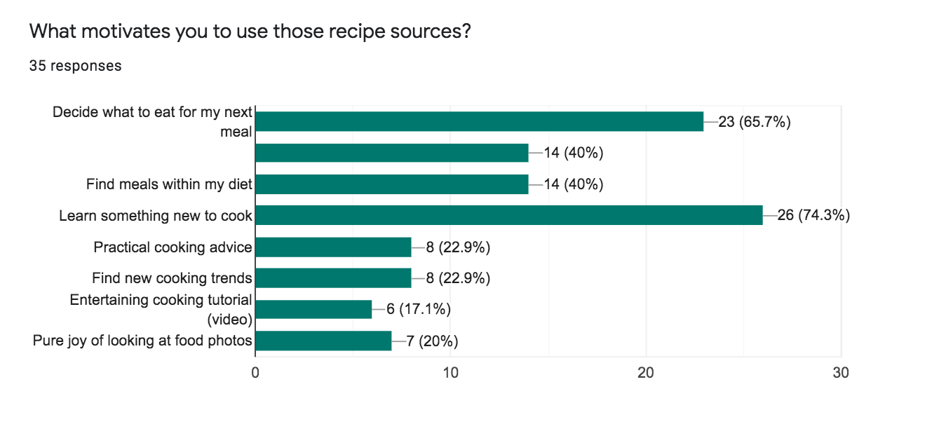
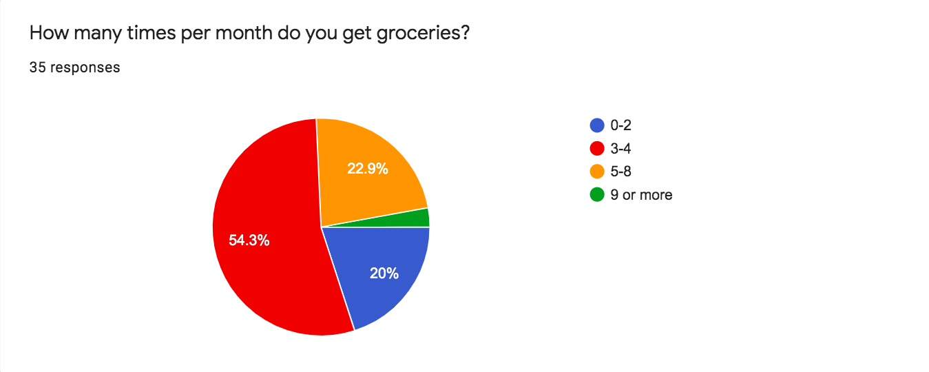
I started by surveying 35 people to gather information on their experience around cooking at home and to test my hypothesis that others also experience friction when planning for their meals.
Key findings
n=35
The majority of participants look for recipes to:
learn something new to cook (74.3%)
decide what to eat for their next meal (65.7%)
Avoid giving too many options. We don’t want users to “watch trailers all night before finally choosing what to watch”.
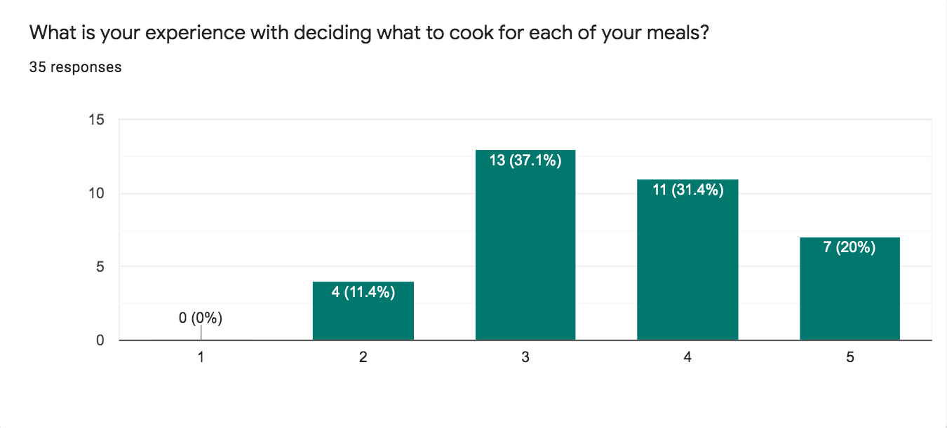
51.43% of participants positively rated their experience with deciding what to cook.
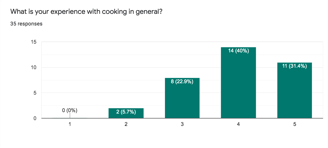
71.43% of participants positively rated their experience with cooking in general.
Suggests next meal, using user inputted data of what they have in the pantry/fridge.
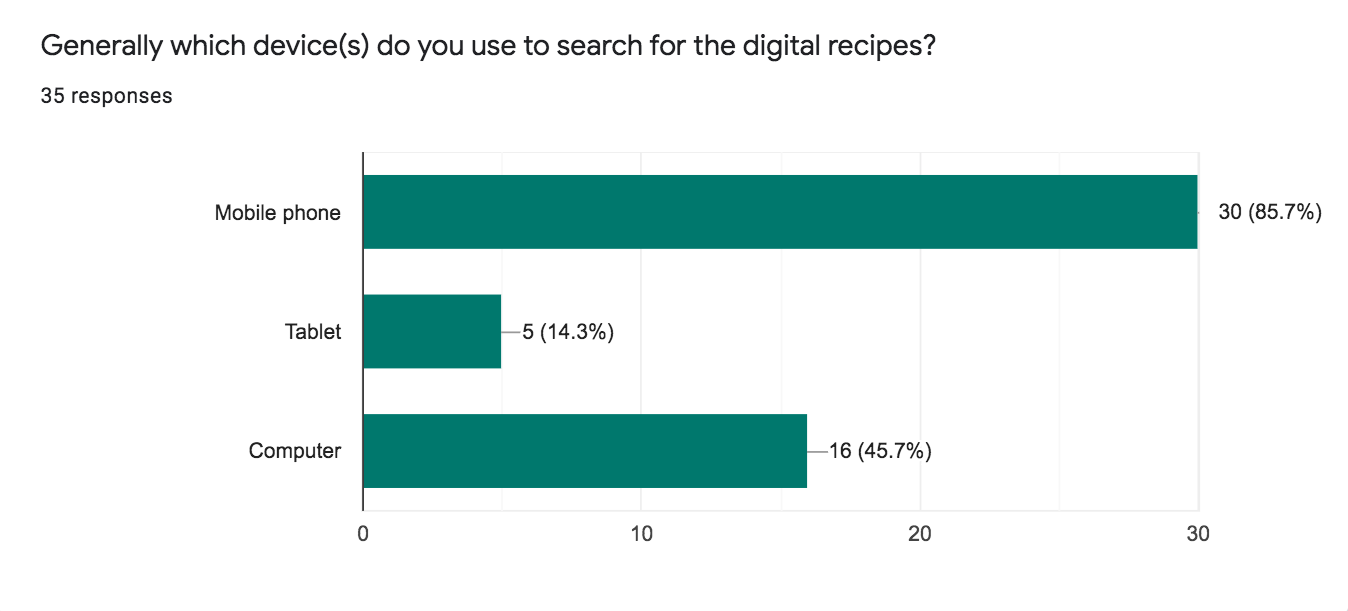
Most participants (74.3%) use websites and social media (particularly Google, Pinterest, Youtube) as opposed to downloading an app (28.6%).
A progressive web app so that users don’t need to take extra time to search for and install a native app. The use of the progressive web app can be optimized by adding it as a shortcut on phone home screen.
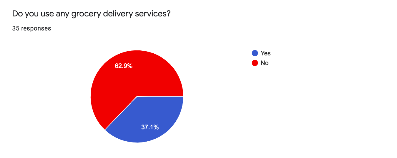
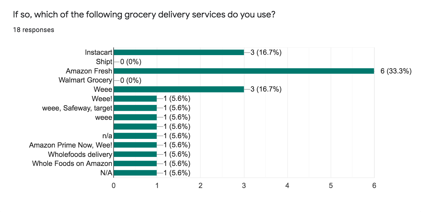
13 of 35 participants use grocery delivery services, broken down into the following services:
Amazon | Whole Foods (56.25%)
Weee (31.25%)
Instacart (18.75%)
Partner with these grocery delivery services so that users can have missing ingredients delivered in a jiffy using well-acquainted services.
Notable quotes from participants
“Some recipes come from blogs and sometimes there’s too much content before you get to the ingredients and steps…”
“YouTube videos are nice because we see the action in realtime.”
“One I use is Yummly, like the options and easy to like previous ones. I wish i could create my own categorizes though.”
“I like looking at recipes at food sites, but I wish they were available as a step-by-step in mobile form”
“I hate how it goes into sleep mode unless I’m actively touching my phone. If the app is open, I should have an app setting that keeps my screen on. I’m too lazy to go to my phone settings to turn off sleep mode every single time I’m cooking.”
Persona
Kris & Chris were created from the voices and thoughts of the people I surveyed and of my own.
Laying it all out
The persona’s primary objectives were used to think through user tasks and create flows for 3 main features.
User testing and refinement
Two experts in the realm of UX Design and mobile apps tested out the first high fidelity prototype. Out of the 3 features listed above, the flows that included the “My List” screen (later renamed to “Pantry”) had the highest priority usability issues.
Issue 1
No way to easily move between the “I don’t have” and “I have” lists.
With less than 5 items each, all items are above the fold. But what if each list had 20 items?
Issue 2
Unclear what to do with the selected items. Do they indicate next action to be “Buy” or “Find Recipes” or both?
Issue 3
Unclear how to delete items.
Tackling Issue 1
Before
Long scroll through ingredients
After
Ingredients organized under two tabs
When each of the “I don’t have” and “I have” lists has over a dozen items, it would be an issue to scroll to view each list.
Solution:
Divide the ingredients under two tabs: “in stock” and “out of stock”
Make the “in stock” list as the default view in Pantry, since the objective of this app is to help users cook with what they already have
Tackling Issue 2
Before
Unclear user flows from the Pantry list
After
Clearcut pages with only relevant action icons highlighted
There isn’t enough visual cues to let the user know what the next potential steps are after selecting items. It’s confusing when both the “buy” and “find recipes” buttons are active even when ingredients from both “have” and “don’t have” lists are selected.
Solution:
Only the relevant action icons get highlighted once one or more ingredients are selected
Single call to action buttons (“Find Recipes” or “Buy”) per page
Tackling Issue 3
Before
Unclear how to delete an item
After
Salient action icons
There’s a lack of signifiers as to how an item can be deleted. I was wrong to assume that users would know to tap on an item to invoke the keyboard (like the iPhone Reminders app).
Solution:
Salient icons for common action items:
select all items
delete
move to “out of stock” list
move to “in stock” list
search list
more actions (ie: sort by…)
Putting it all together
Once the issues have been fixed, I got approval from the two experts who I conducted the usability tests with. Here are the 3 core features that fulfills the primary goals of the persona.
newfinalestfinal.xd
Retrospective
One of my goals of this project was to branch out from being a pure Sketch user and learn Adobe XD. At first, I was taken aback by XD’s lack of the x and y coordinate rulers and the pixel gridlines on zoom. However, other great features, like creating buttons that resize based on the text, became more salient.
For a future concept, it would be interesting to see this web app pair with an AR/VR set (like Microsoft’s HoloLens) to assist users prepare meals without having to constantly touch their devices and receive live audio and visual feedback.